28.07.26
Favourite grade from last year
What is it about this film that made you choose it as your favourite?
Sometimes a project comes along that, from the get-go, you know is going to be one for the memories. When Benjamin Werner and Martin Senyszak mentioned they had a new project they were bringing in shot in Norway, on incredible lenses from Hawk, and with an idea for a specific photographic look in mind — my eyes lit up.
What influence did you draw from?
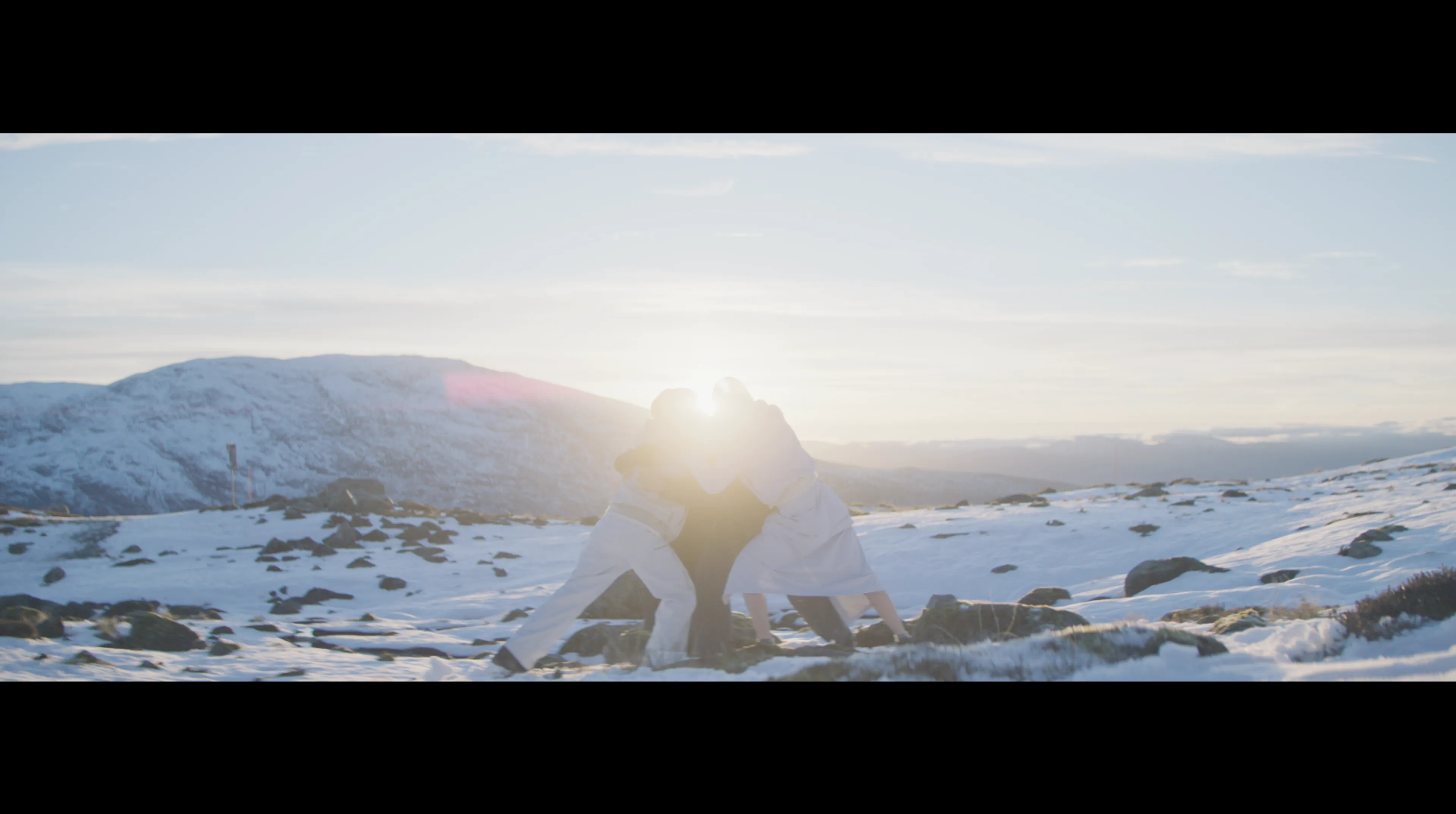
From the get-go, Benjamin wanted me to see what we could do about aligning the grade to the beautiful tonality of photographic landscape C-prints think Nadav Kander, Jeff Wall, Andreas Gursky. These photographers’ images have this subtle yet standout quality in how they work tonally.
I think it’s something we always strive for in grading, especially in films: this idea of an image that is both soft in contrast and natural in tone, but also somehow still feels defined, deliberate and three dimensional. You never want to crank anything or overdo the look, but you want it to feel bold and interesting, yet also subtle and precise.
I went back through my references and also landed on the film Nomadland, which I think does this understated yet beautiful look justice; it has a look to it that is so lovely, almost effortless.
“I think it's something we always strive for in grading, especially in films: this idea of an image that is both soft in contrast and natural in tone, but also somehow still feels defined, deliberate and three dimensional”
How did the equipment used inform your grade?
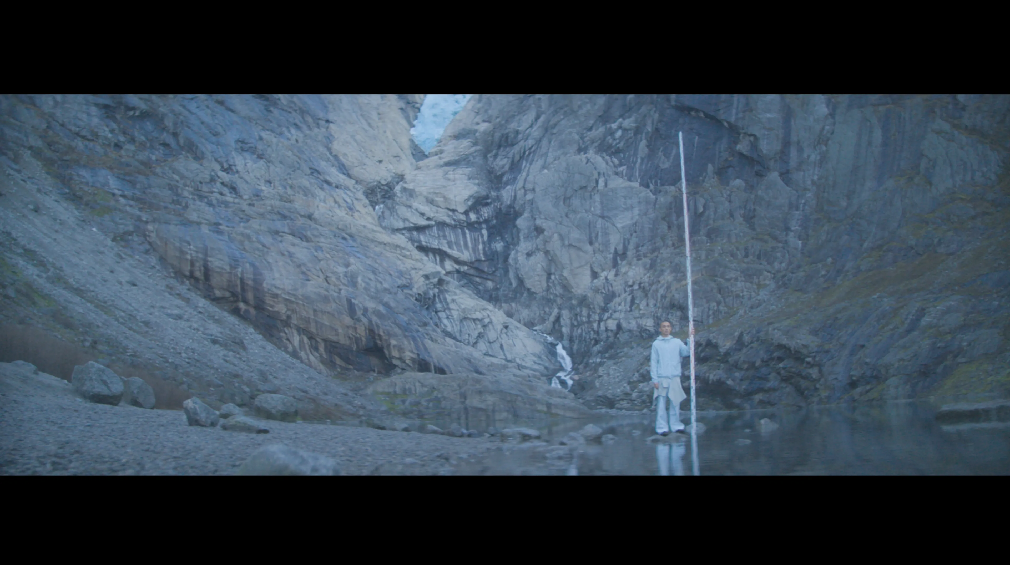
It has to be said that Martin’s camera work is so beautiful, and the setting of these icy landscapes in Norway opened up this incredible palette of earthy pastels in an ice enriched landscape. The pairing of the Alexa35 camera and the Hawk anamorphic lenses with their lovely characterful anamorphic optical edge drop-off really make this giant ruler shot sing for me.
“The best grade isn't always the most dense, rich, contrasty image, but the one that lets the film speak to exactly what it was always meant to be”
Did the grade evolve as you went along?
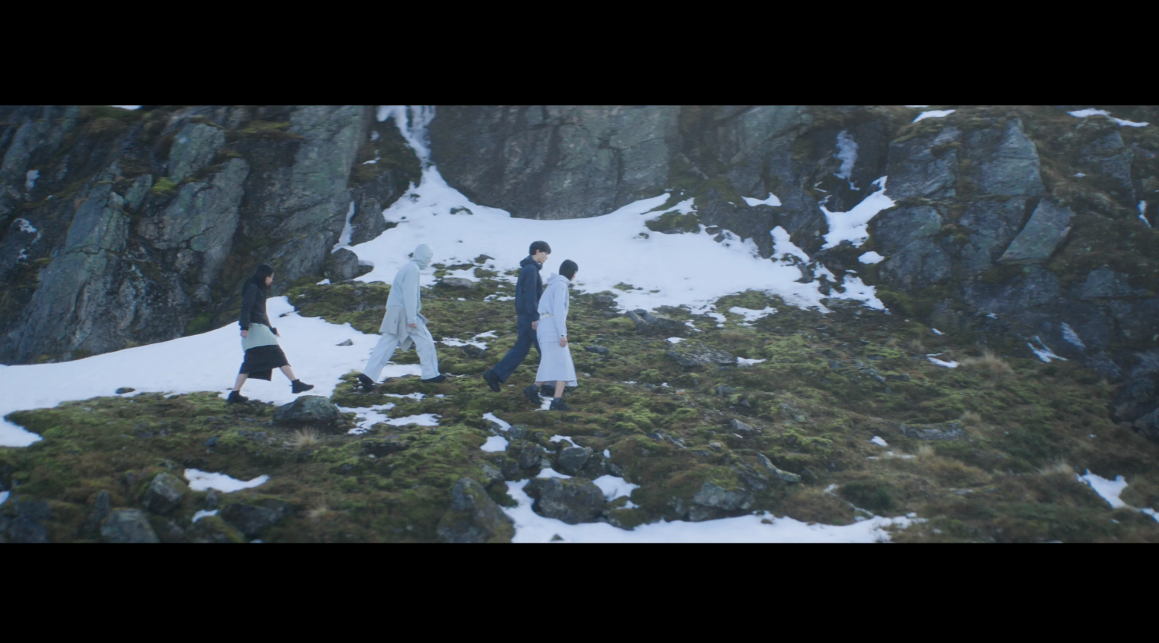
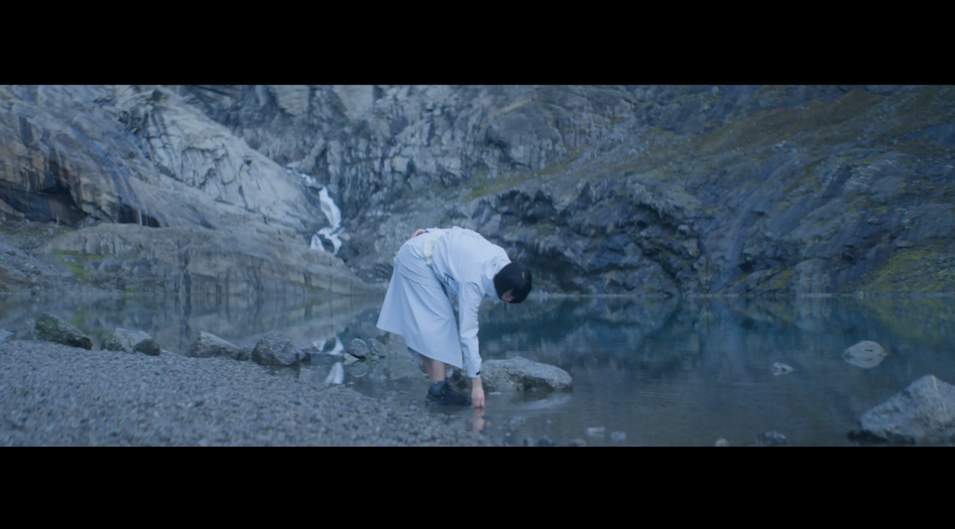
One of the main things we ended up doing with the grade was really keeping an eye on how we dealt with contrast and saturation.
There was this almost soft limitation we devised, centred around a grading technique I had heard of before called ‘Restricted Illumination’, in which we avoid going too bright on the overall brightness levels of the image. You can look at it as almost a way to emulate the idea of printing to paper, so your chosen white is more of an ambient paper white, rather than the sharp, pure, illuminated white we are so used to seeing on our screens.
Keeping the white point lower in the grade then means you adjust your contrast of the image based on this new found lower, high limit. Then you are in this more restricted tonal range where contrast and curves become both a lot more delicate and you have work with more subtly.
“Getting to be part of that conversation, and helping shape the final feel of an image everyone has worked so hard to capture, is a real privilege”
What did you learn about this grade that you would apply to others in the future?
I think this grade was a nice lesson in how to grade with a bit of nuance and hits home about keeping things subtle and playing to the strength of the source images, and letting even letting the source speak for itself too but it did also make me really think about how much responsibility a colourist does carry with regards to how a film can look and that is something a director, a cinematographer, a client and the whole team are trusting you with.
Getting to be part of that conversation, and helping shape the final feel of an image everyone has worked so hard to capture, is a real privilege. It’s a reminder that restraint is often the most powerful tool you have, and that the best grade isn’t always the most dense, rich contrasty image, but the one that lets the film speak to exactly what it was always meant to be.